LEO KAHL Watercolor Art and Watercolor Instruction
  • Home
  • Canvas Paintings
    • Mount Dora Florida
    • Delmarva Coastal Impressions
  • Watercolor Art
    • Memories of Ocean City Maryland
  • Watercolor Instruction
    • Free Watercolor Tutorials
  • Watercolor Book
  • CONTACT US
  • PRINTS
  • ABOUT THE ARTIST
  • BLOG
  • NEWS

WATERCOLOR PAPER MATTERS!

3/23/2019

15 Comments

 
During my watercolor adventures, I've utilized a number of different brands and types of watercolor paper.  The quality, sizing and texture play a huge role in the kinds of effects achievable with the watercolor medium.  I've learned to stay away from hot press papers, they may be fine for intricate, positive shape filling type art but do not allow for the time necessary for the intermingling of hues. Cold press is better but my choice is always the "rough" type texture. I love how you can deftly pull your brush across the tops of the ridges to create fragmented light effects.

The sizing ratio is also very important. Too little sizing or old paper where the sizing as dried out of the paper is also problematic. I've done class demos on old paper only to create a big blotchy mess in front of my students.

My go to paper is the Arches, rough style...I only use 140 lb. paper, I've seen little need for the 300 lb. heavy weight paper however, I can see where this might be a good choice for larger works. My pigment and water mixtures interact predictably with the gum arabic ( and other chemistry)  sizing percentages in this paper.

The following painting however, was done on a brand named, Saunders (Rough, 140#). I've discovered that this brand acts quite differently than my Arches paper. I will compare my experiences with this paper in the following set of sequential steps in my painting "Valentines Day".. Enjoy!
Picture
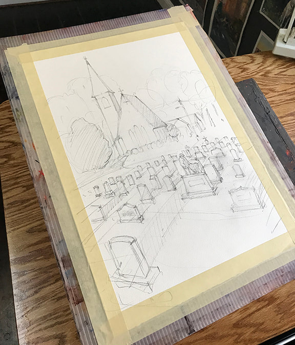
Step 1: Create an accurate drawing with correct perspective. This drawing was composed, not traced from the reference photo. I intentionally emphasized grave stones in fore ground to create a stage for my star actor.
Picture
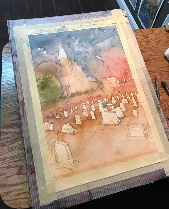
Step 2: I look for all the underlying warm hues and light values and wash these in. The Suanders paper has a robust gelatin layer on the outer surface of paper. This allows for lots of time for your various pigment hues and water to mingle together. It feels a bit like you are out of control but thats a good thing.
Picture
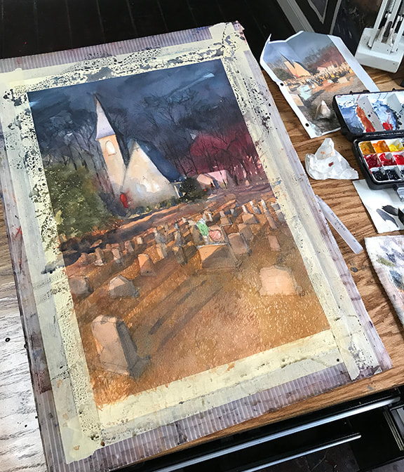
Step 3:  Middle to middle dark values.  In this next layer, I get stronger with the middle strength values. Once again, the Saunders paper wants to allow pigment and water to float around more freely. It can be frustrating but once you get the hang of it you'll see where you can achieve brilliant, subtle, co-mingling of hues. Note the facade of church and the sky.
Picture
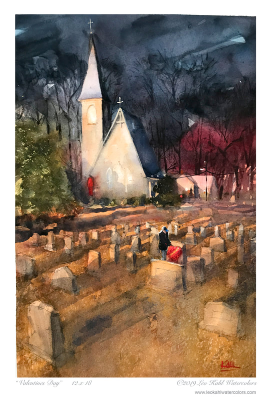
Step 4: Here in the finished painting, you can see where I've punched in some dark details using drybrush including the gentleman and the bouquet of roses.  If you've never tried Saunders paper, I highly recommend experimenting with it. Go for it! 
15 Comments
    Picture

    Author

    Leo Kahl  Watercolor Artist, Watercolour Instructor, Dad, GrandDad, Husband, ex Baseball Player
    ​Pet Lover & Blogger:)

    Archives

    April 2019
    March 2019
    January 2019

    RSS Feed

  • Home
  • Canvas Paintings
    • Mount Dora Florida
    • Delmarva Coastal Impressions
  • Watercolor Art
    • Memories of Ocean City Maryland
  • Watercolor Instruction
    • Free Watercolor Tutorials
  • Watercolor Book
  • CONTACT US
  • PRINTS
  • ABOUT THE ARTIST
  • BLOG
  • NEWS