LEO KAHL Watercolor Art and Watercolor Instruction
  • Home
  • Canvas Paintings
    • Mount Dora Florida
    • Delmarva Coastal Impressions
  • Watercolor Art
    • Memories of Ocean City Maryland
  • Watercolor Instruction
    • Free Watercolor Tutorials
  • Watercolor Book
  • CONTACT US
  • PRINTS
  • ABOUT THE ARTIST
  • BLOG
  • NEWS

complexity & simplicity

4/16/2019

9 Comments

 
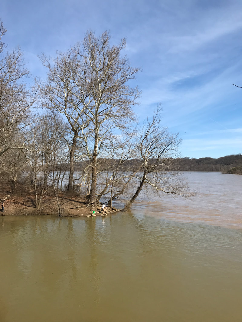
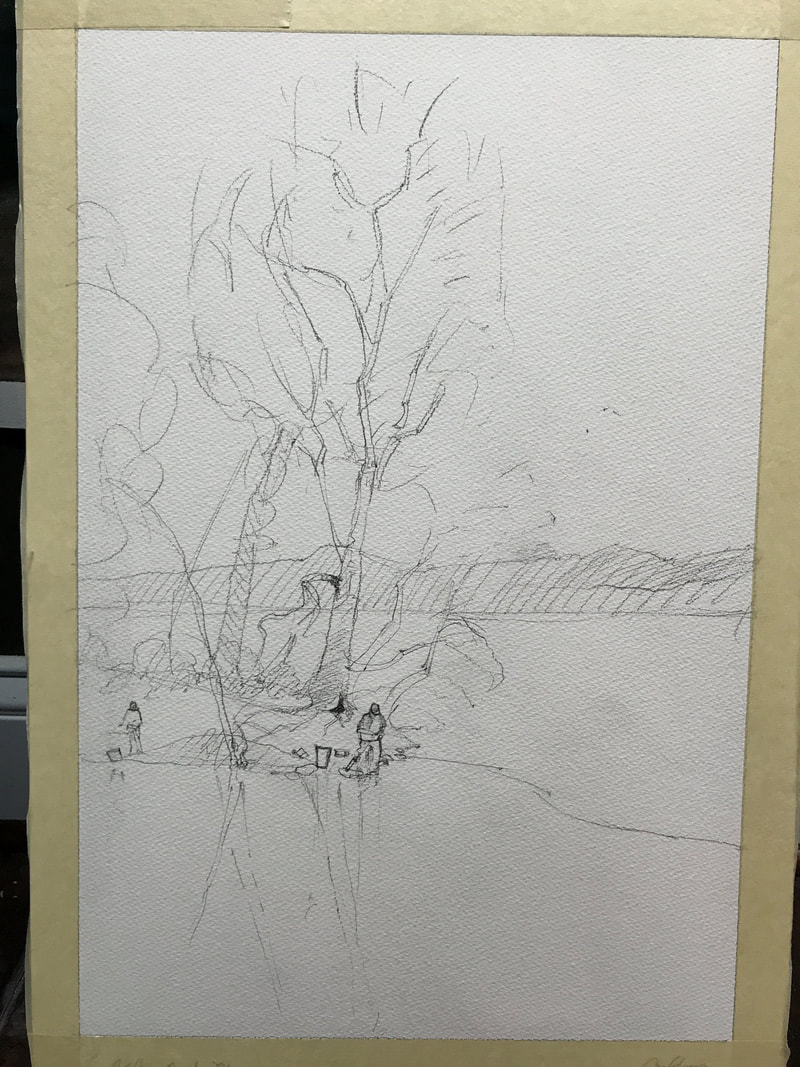
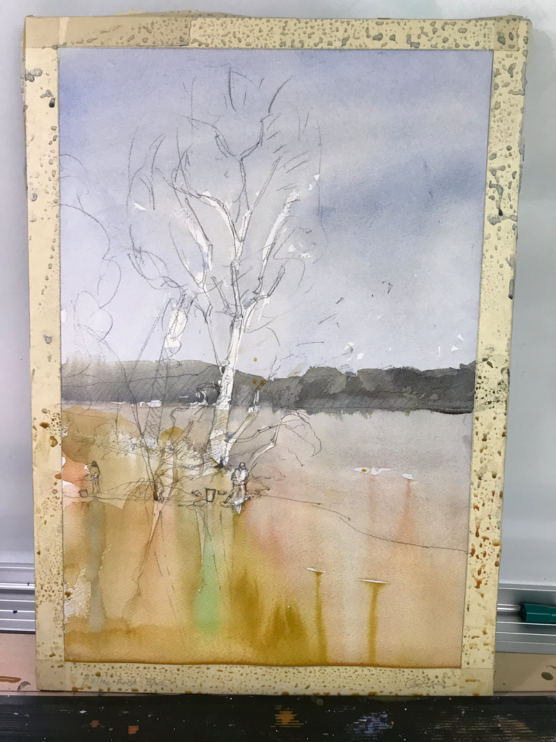
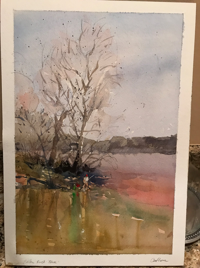
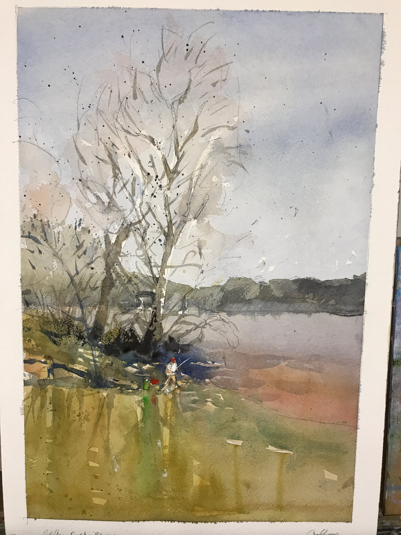
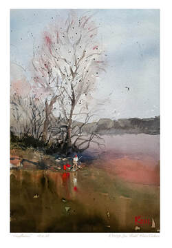
I often find that the simpler my subjects are, the more fun I have painting them. They also inevitably end up being some of my best work. I think maybe its because simple subjects  resonate better with the inherent simplicity of the watercolor medium. I really enjoy allowing large, intermingling washes to do what they want, to surprise me with their lack of rhyme or reason. I call it the art within watercolor. I will describe my creative thoughts and process in the creation of my painting " Confluence"  shown below.  ( Confluence suggests the joining of two rivers. Here, the mighty Susquehanna River is joined by a beautiful, trout filled Maryland tributary called "Deer Creek" 
Picture
Picture
This was the photo I took while walking across an old railroad bridge that crosses Deer Creek. Note the clear delineation in the color of the two rivers.
Picture
Step 2: I looked for the underlying warm hues and lightest values and wash them in. I also left a few whites to help define the big sycamore tree.
Picture
Step 4: At this stage, I begin to strengthen some of the hues that I felt were to weak with darker, more saturated color. I also start adding in my darkest darks using dry brush technique, especially behind my subject, the fisherman. 
Step1:  The drawing.  A simplified, rough approximation of what I saw. I eliminated a few trees to increase the emphasis on the fisherman.  
Picture
Step 3:  Next comes what I believe are the middle values. I approach my paintings in a very structured, methodical manner with respect to just 4 levels of values.
Picture
Final Stage:  Still not happy with the strength in values of the water, I apply even darker, multiple hue washes and allow them to do what they want, kind of like a real river. The green bucket was not visually strong enough to attract your eye to the focal point, so I made it orange. I added some pigment to the wet washes in foreground creek to suggest reflections and let gravity softly pull them downward.  Enjoy!

9 Comments

WATERCOLOR PAPER MATTERS!

3/23/2019

15 Comments

 
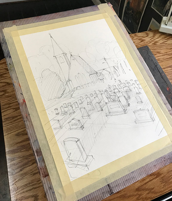
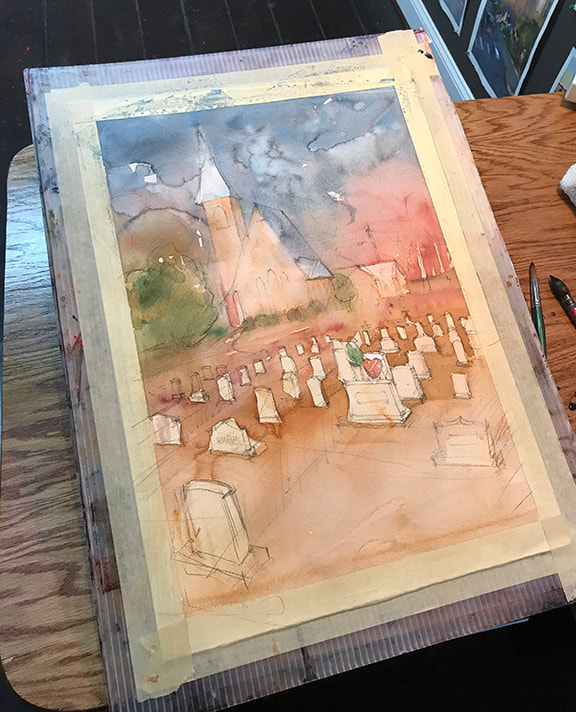
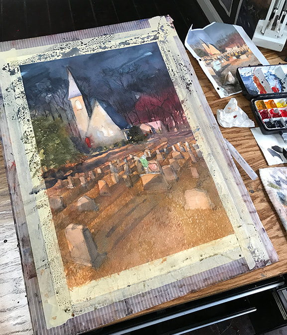
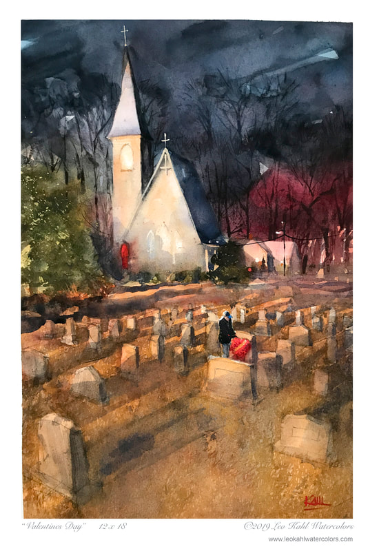
During my watercolor adventures, I've utilized a number of different brands and types of watercolor paper.  The quality, sizing and texture play a huge role in the kinds of effects achievable with the watercolor medium.  I've learned to stay away from hot press papers, they may be fine for intricate, positive shape filling type art but do not allow for the time necessary for the intermingling of hues. Cold press is better but my choice is always the "rough" type texture. I love how you can deftly pull your brush across the tops of the ridges to create fragmented light effects.

The sizing ratio is also very important. Too little sizing or old paper where the sizing as dried out of the paper is also problematic. I've done class demos on old paper only to create a big blotchy mess in front of my students.

My go to paper is the Arches, rough style...I only use 140 lb. paper, I've seen little need for the 300 lb. heavy weight paper however, I can see where this might be a good choice for larger works. My pigment and water mixtures interact predictably with the gum arabic ( and other chemistry)  sizing percentages in this paper.

The following painting however, was done on a brand named, Saunders (Rough, 140#). I've discovered that this brand acts quite differently than my Arches paper. I will compare my experiences with this paper in the following set of sequential steps in my painting "Valentines Day".. Enjoy!
Picture
Step 1: Create an accurate drawing with correct perspective. This drawing was composed, not traced from the reference photo. I intentionally emphasized grave stones in fore ground to create a stage for my star actor.
Picture
Step 2: I look for all the underlying warm hues and light values and wash these in. The Suanders paper has a robust gelatin layer on the outer surface of paper. This allows for lots of time for your various pigment hues and water to mingle together. It feels a bit like you are out of control but thats a good thing.
Picture
Step 3:  Middle to middle dark values.  In this next layer, I get stronger with the middle strength values. Once again, the Saunders paper wants to allow pigment and water to float around more freely. It can be frustrating but once you get the hang of it you'll see where you can achieve brilliant, subtle, co-mingling of hues. Note the facade of church and the sky.
Picture
Step 4: Here in the finished painting, you can see where I've punched in some dark details using drybrush including the gentleman and the bouquet of roses.  If you've never tried Saunders paper, I highly recommend experimenting with it. Go for it! 
15 Comments

Every Watercolor Artist has a plan!

1/11/2019

12 Comments

 
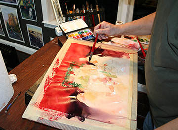
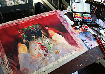
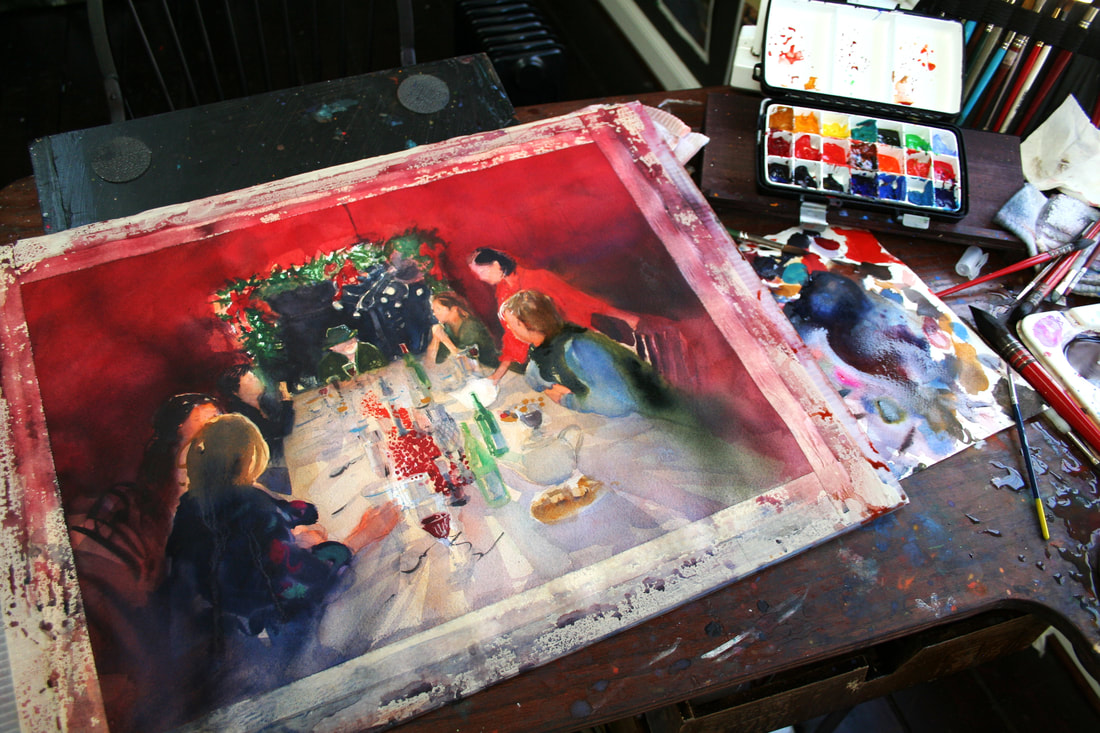
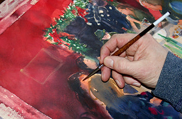
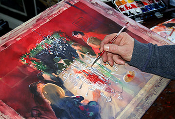
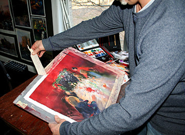
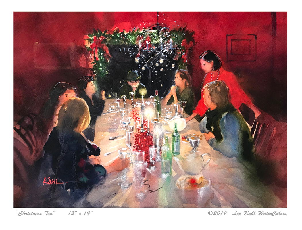
I came across an insightful quote from Mr. Mike Tyson, the former heavy weight boxing champion, that I thought was rather appropriate to the watercolor artist. It goes something like this...​"Everyone has a plan until they get punched in the face"
For every painting concept that I come up with, I always arrive at the same starting point. A big, white sheet of watercolor paper punching me in the face.  Even though I can kind of see the finished painting in my head, actually arriving there is an entirely different matter.
Maybe its just a matter of experience, I’m not sure. I have plenty of experience but inevitably go 10 to 15 rounds with a piece until it succumbs to my vision.
I'll will walk you through my painting "Christmas Tea"  from start to finish and try as best I can to relay my thoughts on each step in the process. Lets see if I get knocked out or create a knockout piece!
"Christmas Tea" By Leo Kahl
Picture
Step 1: Occasionally, I enjoy doing paintings that actually look like my family or friends. In this case, I traced over an enlarged laser copy onto tracing paper. I rubbed soft graphite over back side of tracing paper then traced the figures using a ball point pen, transferring the image on to my Arches Rough watercolor color.  Additionally, I adjust the size of the figures to enhance my composition.
Picture
Step 2: As with most all of my paintings, I lay down washes of warm undertones, This wash will "push through" subsequent layers and add glow to my painting
Picture
Step 3: Now I get into the meat of the painting by adding rich middle values and hues. This layer utilizes varying levels of translucency, but not quite opaque just yet. I work from the furthest point in background towards the foreground.
Picture
Step 4: This painting did not involve a lot of negative space painting, something I normally focus on. At this stage, I'm adding lots of elements to the table along with soft, translucent shadows
Picture
Step 5: I finish the figures in foreground in a loose and unfocused manner. I want the viewers eye to be attracted to the pure white tea pot held by the host.
Picture
Step 6: I protect the majority of my painting with paper towels and splatter some light blue paint  (Cerulean Blue and some Chinese White) Adding a little Chinese white pigment will help the chandelier to look illuminated. I love the effect of splattering paint for certain subjects such as this.
Picture
Step 7: I use dark opaque paint for small details on the faces and elsewhere.
Picture
Step 8: This was a unique subject. I wanted to convey the beautiful white linen table cloth and plethora of specular highlights on all the crystal and glassware, this is what I remembered so strongly about this experience. This could have been accomplished in a more abstract manner using dry brush to allow hundreds of white specks of paper to show through. I opted for a more manual and controlled effect by adding white highlights to each item on the table.
Picture
Done!: I love peeling the masking tape of my painting when done. The white border acts like a matt board and isolates your image form its surroundings. 
Picture
Well, this is the finished piece. Is it what I planned?  Not exactly, but that's OK. I feel that I captured the atmosphere and mood of this annual holiday gathering with great friends. This  is what the word "art" means to me.
12 Comments
    Picture

    Author

    Leo Kahl  Watercolor Artist, Watercolour Instructor, Dad, GrandDad, Husband, ex Baseball Player
    ​Pet Lover & Blogger:)

    Archives

    April 2019
    March 2019
    January 2019

    RSS Feed

  • Home
  • Canvas Paintings
    • Mount Dora Florida
    • Delmarva Coastal Impressions
  • Watercolor Art
    • Memories of Ocean City Maryland
  • Watercolor Instruction
    • Free Watercolor Tutorials
  • Watercolor Book
  • CONTACT US
  • PRINTS
  • ABOUT THE ARTIST
  • BLOG
  • NEWS